

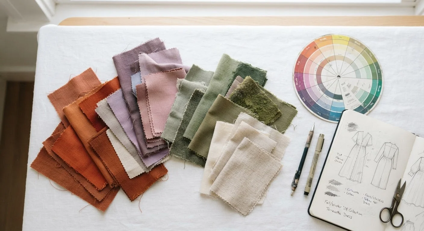
The Forecasting Pipeline: Where It All Begins
Long before a shade of dusty lilac or warm apricot lands on a store shelf, it has traveled through a remarkably structured prediction machine. Color forecasting agencies — specialized firms whose entire business is anticipating aesthetic direction — begin their work roughly two years out from retail delivery. Their analysts scan an unusually wide net of signals: emerging art movements, shifts in global politics, economic confidence levels, architectural directions, and yes, social media sentiment.
The goal isn't to manufacture a trend from nothing. It's to identify a cultural mood already forming and translate it into a specific color story. A period of collective anxiety, for example, might point forecasters toward grounding earth tones or restorative greens. A surge in optimism might favor saturated, expressive brights. Forecasters are essentially cultural translators — converting abstract feeling into something a dye house can actually produce.
Major trade events like Première Vision in Paris and Texworld in New York serve as critical gathering points where these early color directions are formally presented to mills, fabric producers, and brand buyers. By the time a designer sketches a collection, the palette conversation has already been underway for months.
18–24 months
Lead time before a color reaches retail
Industry standard cited by major forecasting agencies and trade organizations, reflecting the time needed for textile production, sampling, and retail buying cycles.
$30B+
Annual U.S. apparel retail market influenced by color forecasting
Color direction shapes purchasing decisions across the U.S. apparel sector, where seasonal palette alignment affects everything from manufacturing orders to marketing campaigns.
2x/year
Major international trade show cycles
Key events like Première Vision occur twice annually, serving as the primary venues where forecasted color palettes are presented to designers, mills, and retail buyers.
Pantone, Trend Books, and the Infrastructure of Color
The Pantone Color Institute is arguably the most publicly recognizable name in color forecasting. Its annual Color of the Year announcement — typically made in December — generates genuine cultural conversation and measurable ripple effects across fashion, home design, beauty, and tech accessories. The selection emerges from a process that includes input from designers, artists, and cultural observers worldwide.
But Pantone is far from alone. Agencies like WGSN, Trendalytics, and various in-house forecasting teams within major retailers build proprietary trend books: thick, expensive publications filled with curated palettes, fabric swatches, and cultural context. These books are sold to designers and buying teams who use them as a compass, not a rulebook.
The distinction matters. A trend book suggests direction; a creative director decides how literally to follow it. Some brands plant a forecasted color front and center. Others use it as a subtle accent, letting it breathe through accessories or lining details. This is why you might see the same trending shade interpreted as a bold maximalist coat at one brand and a quiet pocket square at another. For more on how color intersects with personal expression and mood, see what researchers say about dopamine dressing.
“Color is a power which directly influences the soul. It is the keyboard, the eyes are the hammers, and the soul is the piano with many strings.”
— Wassily Kandinsky, Influential abstract artist and color theorist, author of 'Concerning the Spiritual in Art'
From Runway to Rack: How Color Travels Downstream
Once runway collections debut — typically at New York, London, Milan, and Paris Fashion Weeks — a secondary wave of analysis begins. Trend editors, retail buyers, and in-house design teams comb the shows for color consensus: which shades appeared across multiple designers? Which felt like a genuine directional shift versus one designer's personal experiment?
Mass-market and mid-range retailers use this runway data to validate or adjust their own buying plans. A color confirmed across a dozen runway collections is a much safer inventory bet than one seen in a single show. Manufacturers then set up dye runs, and the logistics of getting a specific shade consistently reproduced across thousands of garments kicks in — a more technically demanding process than it sounds.
Meanwhile, fast-fashion operators operate on shorter cycles, sometimes moving a color from trend identification to production in weeks rather than months. This speed gives them flexibility to respond to viral social media moments, though it can also result in saturation that exhausts a color faster than traditional forecasting intended. Understanding these dynamics is useful whether you're a devoted trend follower or someone building a more enduring wardrobe — building a wardrobe that survives trend cycles explores the latter approach in depth.
Why Some Forecasted Colors Land — and Some Don't
Color forecasting is an informed discipline, but it isn't a guarantee. A shade that makes perfect cultural sense on paper can fall flat when consumers encounter it on a hanger under store lighting. Forecasters freely acknowledge this gap: their work increases the probability of a color resonating, but final validation always belongs to the shopper.
Several factors determine whether a forecasted color achieves real traction. Wearability across a range of skin tones matters enormously. So does versatility — can the shade pair with what people already own? Economic conditions play a role too: in tighter financial climates, consumers often gravitate toward neutrals and proven basics rather than committing to a polarizing statement color.
Social media has added a genuine wild card to the process. A single high-profile moment — a widely discussed film, a celebrity appearance, a viral video — can elevate an unexpected color to cultural dominance faster than any trend book anticipated. Forecasters now actively monitor these real-time signals to refine mid-cycle, a flexibility the industry didn't need as urgently a decade ago.
For readers curious about how fashion philosophy intersects with these trend mechanisms, the capsule wardrobe versus trend-driven shopping debate frames two genuinely different approaches to navigating a color-saturated retail landscape.
Frequently Asked Questions
Professional color forecasting agencies, in-house design teams, and organizations like the Pantone Color Institute collaborate to identify directional palettes. They analyze cultural, economic, and aesthetic signals well in advance. Runway designers and mass retailers then interpret and amplify those directions through their own collections.
Typically 18 to 24 months before a color appears in stores. This lead time accommodates textile production, dyeing, sampling, and retail buying cycles. By the time you see a shade on a rack, forecasters have already moved on to seasons further ahead.
Yes, meaningfully — though it's one input among many. Pantone's annual selection generates significant media attention and signals a cultural mood that designers, manufacturers, and retailers actively respond to. Its influence extends beyond apparel into home goods, cosmetics, and graphic design.
Social platforms like Instagram and TikTok can accelerate a color's rise or fall much faster than traditional forecasting cycles. Viral moments — a celebrity outfit, a film aesthetic — can push a shade into mass awareness within weeks, sometimes diverging from what forecasters had planned.
Because most brands subscribe to similar forecasting services and attend the same international trade shows, color convergence is built into the system. Coordinated palettes also benefit supply chains, since textile mills can produce large dye runs of the same shades more efficiently.
Indirectly, yes. When a forecasted color becomes a bestseller, demand can drive up the cost of specific dyes and fabrics. Conversely, last-season colors are often discounted as retailers clear inventory to make room for the incoming palette.
The content on this site is for informational purposes only and is not a substitute for professional advice. Always consult a qualified professional for guidance specific to your situation.